Album Covers, Part 1
After all these years, I figured it was time to talk about album covers. Vinyl records have never really gone away, and now the younger generation seems to be discovering the joy of vintage music packaging. I'm glad.
So I've been sorting through my own faves and decided to come up with a list, which will (one hopes) invoke discussion.
Everyone has different tastes in what they like in album covers. The choices on this list are informed by interests in mid-century modern art, minimalism, and pop.
As a result, you'll see no Yes albums featuring Roger Dean's adolescent space fantasies. No hair-metal pretty-boy-in-makeup shots. No silly wet dreams of priests drowning in thunderstorm-swollen rivers, leering skeletons, fly girls in lingerie, rappers in mall gear, or three-breasted vixens eating alien hedgehogs. Sorry.
In addition, most of these sleeves hold records that I love. That's probably because of shared sensibilities. Of course, plenty of albums high on my musical list have covers I consider unsightly (Buffalo Springfield Again, most of REM's and the Velvets' oeuvre, all of Juanes' LPs, and the Beach Boys' Friends are particularly egregious offenders).
Many new groups' releases feature cartoons or "naive" drawings, which as album cover art generally aren't my cup of tea.
In addition, I can't claim to know much about LPs from around the world, so these selections are limited to North America and the U.K.
So what makes a good album cover? It's not just an arresting image, although that's critical. For me, it's the way the cover works with the music inside; whether it's a cool image that I'd want to look at repeatedly; and the circumstances from which it came. Yes, I'm one of those annoying history geeks.
So, anyhoo, I compiled 40 great ones, and then five others that I considered my all-time favorites. To drag out the suspense interminably, I'll list the first 40 of them chronologically. Once I've gone through the 40, the all-time top five will then follow.
Off we go.

In the Wee Small Hours, Frank Sinatra, 1955
Most of Sinatra's drama came from the sense that it was just he and you alone in a room, him singing his heart out for a woman who's gone away. The loneliness of the music in this great album is even more palpable than the utter desolation of the cover.

Elvis Presley, 1957
Some people prefer the Clash's London Calling to this. I think that this shot of Elvis, from his first album (not second--thanks Bob), is FAR more interesting than one of Paul Simonon smashing a perfectly good bass guitar. And shouldn't originality count for something? This has inspired dozens of parodies.

The Freewheelin' Bob Dylan, 1963
Many Dylan covers lend themselves to parody because the images are as strong as the music inside. This is my favorite. Suze Rotolo and her guy are walking confidently not on the sidewalk, but rather through the middle of a slushy street. There's a message there, no?

Please Please Me, The Beatles, 1963
What a punch in the gut! Here's an incredibly charismatic bunch of young men--none older than 22--looking down with total confidence from a modern British office building. Far above what other pop performers were doing at the time, and still shocking today.
 Getz-a-Go-Go, Stan Getz, 1964
The smoky, sexy music inside this foldout cover is perfectly complemented by the pictures and graphics. Getz, directing the band, was a master of his instrument, and it really is his show. The colors, type, and images are just perfect.

I Like God's Style, Isabel Baker, 1965?
An album that even most music freaks haven't heard, and one that even fewer people could stand to listen to. Isabel Baker, a gravel-voiced teenage girl from Orange County, did this devotional album in the mid-60s to show her love for Jesus. That's fine, but just bathe me in gold and purple and tell me more about the mod-dressed blonde playing that guitar!

Mr. Tambourine Man, The Byrds, 1965
Oddly enough for such a groundbreaking band, most of the Byrds' sleeves are conventional and, ultimately, disposable. For their first album, though, the distortion of the fisheye lens puts the band, which explored the tension between distance and passion in its music, at the forefront of 1965 rock design. Making the photographic technique part of the cover itself inspired ensuing sleeves by the Beatles, Stones, Kinks, Pink Floyd, and Captain Beefheart, to name just a few. It's ineffably cool.

My Generation, The Who, 1965
The Who may not have been qualified to win beauty contests, but this shot from their debut album spells out exactly what they were: sharp-dressed, aggressive, uncompromising, and a perfect mix of street smarts and art school hip. Bands still try to look like this.

The Piper at the Gates of Dawn, The Pink Floyd, 1967
Interesting looking band + great clothes + good pose + interesting photographic effect = one of the signature sleeves of its decade.

Between the Buttons, The Rolling Stones, 1967
Of all the Stones' "company front" covers, I like this one the best. It's a harsh image, borrowing the worn-down star look from 'Beatles For sale' and bringing it one step further, deep into the Stones' hard-partying world of winter 66/spring 67 and the effect that the lifestyle was having on most members of the group.
British minimalism, Chicago jazz funk, and eight more coming in my next post! Thanks for coming by.
posted by Stuart Shea at 9:10 AM
![]()


12 Comments:
Nice stuff, Stu. You might get a kick out of Nick de Ville's handsomely illustrated book Album--which is perhaps obviously about the history of album art. It also features capsule biographies of many of the most important designers. Even though I read the book more than a year ago, I was still categorizing and classifying every cover as I went through your post. All of those sixties rock albums, for example, were all about showing band members as carefree or mysterious.
11:52 AM, August 25, 2009
How this for good timing?
12:03 PM, August 25, 2009
Thanks, guys.
One thing I always loved about the 'Freewheelin' photo because it presented the confident-looking Suze Rotolo as an equal partner in the enterprise.
3:19 PM, August 25, 2009
Frank Sinatra is a cool musician for all time. How I wish I could be like him someday. At present, I am learning how to play congos, after which I will start learning how to play guitar.
5:36 PM, August 25, 2009
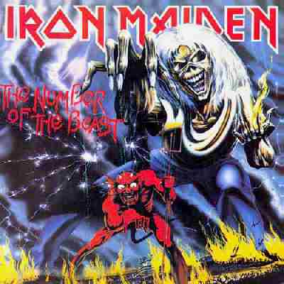
OK. In full disclosure, I have that Ratt album, though it's a subpar effort (laugh all you want about every Ratt album being subpar, but their first album is a pop metal masterpiece). I also have and revere those Dio and Iron Maiden albums.
Offhand, without digging through my whole vinyl collection, my favorite album covers are:
Metallica's Master Of Puppets
Led Zeppelin III
Rush's A Farewell To Kings
6:05 AM, August 26, 2009
Speaking of Dylan...
...this ought to be a hit...
9:31 AM, August 27, 2009
This has been mentioned on the GREAT WGN Nick Digilio radio show before with callers calling in their fave (usually well known) LP covers. Personally, my earliest memories of GREAT covers were "Disreali Gears" and the inner gatefold of "Wheels of Fire" both by Cream and also "Rhinoceros" all from 68 & 69.
NOW, how about this stupid thought that entered my brain yesterday as my girlfriend was going thru kitchen tile samples at the local flooring store? She starts showing me these different colored squares and I would comment just off hand, "That one looks like the 'Emerson, Lake & Palmer' ("Lucky Man" one) album cover." Then, "That one looks like the 'John Lennon Plastic Ono Band' cover (OR the 'Yoko Ono Plastic Ono Band' cover--your choice!)." Then, "That one looks like the 'Led Zep IV'" cover." Who knew that possibly the most BORING album covers come from flooring tile designs?? Haha.
BTW, am I the only one who might thing the Chicago logo LPs are actually COOL and nice design variations of the original "Chicago" logo? BTW, "boring" is how I would describe their "Hot Streets" cover. I can see why they returned to the number series. Yet, the original rare "Questions 67 & 68" pic sleeve is CLASSIC!! Clark Besch
4:57 PM, August 29, 2009
Stu, I found this blog after reading your R & R's Most wanted (which I thoroughly enjoyed). Upon returning it to the Park Ridge Library a woman at the desk said she knew the autor. After a brief description I relized I may know you also. In the mid 80's I went to many shows with a girl from P.R. named Debbie. She had a friend named Stu (prob you) and we all saw a few shows together. One was Alex Chilton at Gaspars. Another was Material Issue at a former strip joint on route 12. I remember talking about my love of The Replacements with you. In an interesting bit of irony I am looking at an album cover I had framed caled "The Original Hootenany Volume 2" It is an old folk comp. I did not know until last year that The Mats stole the layout.
I really enjoyed reading this blog. On the album cover topic: During another visit to the Library while wearing my "Bad Music for Bad People" t-Shirt I thought I was haluncinating when I cought the same image in the corner of my eye. It turns out the library has an impressive exhibit of album covers: from Killdozer to Godspeed You Black Emperor. Check it out if you have not already. Please let me know if I got the right Stu
11:49 PM, August 29, 2009
Great idea for a series. I'm interested to see where (or if) my favorite - and it's not a close call - lands on your list.
I like all of these a lot except for the Byrds cover (I don't like that effect much - it only really works on Rubber Soul), and the Who cover, which doesn't do much one way or 'tother. The rest are really good. That's Elvis' first album, by the way.
I think I like the rejected remake of Please Please Me for the "Get Back" album even better, because the later Beatles were so much more interesting to look at, but it only really works with the first one as comparison.
An interesting side column might be bad covers to albums containing music you love. The first two that spring to my mind would be Magical Mystery Tour and Queen's "The Game". And "Let It Be" works much better as a t shirt or poster than an album cover.
TWo covers I'm pretty sure won't be on your list that I just love are the multiple shot covers for "In Through the Out Door", which I think is just genius, especially with the inner sleeve that turns colorful when wetted down, and the Limeliters first studio album, which might be my second favorite cover:
http://www.earthwaverecords.com/Pictures/AlbumImg/L/A0063195.jpg
6:14 AM, August 30, 2009
This comment has been removed by the author.
6:16 AM, August 30, 2009
'Company front' Rolling Stones covers? Did you steal that phrase from me and my DCI ilk?
10:24 AM, August 31, 2009
What about Sticky Fingers by the Stones it was way before it's time. It is a shame we now live in a society of downloaders ans no one is buying Cd's anymore. The Cd artwork is the coolest thing.
3:53 PM, November 30, 2009
Post a Comment
<< Home